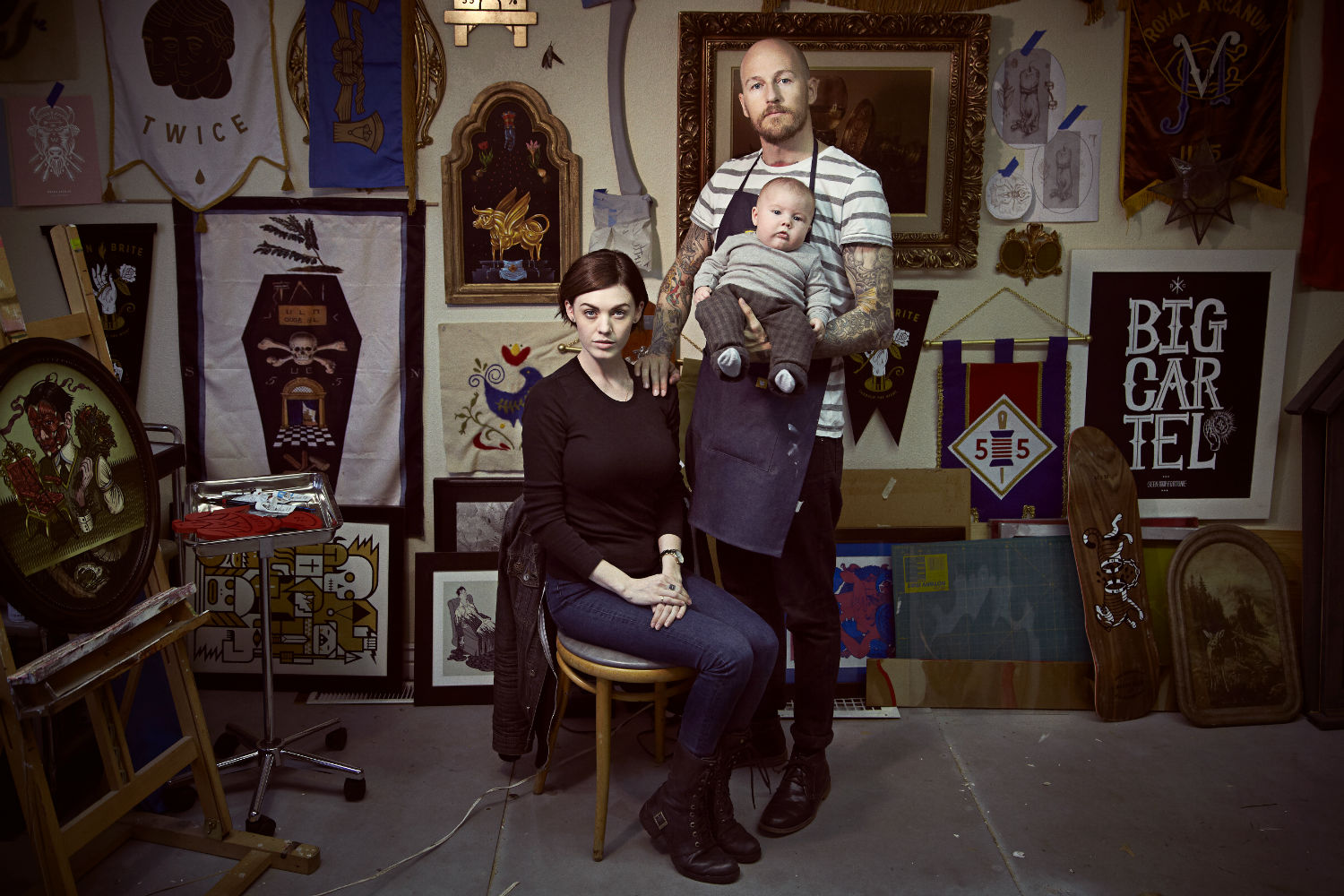


There are infinite ways to tell a story. Salt Lake City-based illustrator and designer Dan Christofferson draws on the abundant, religious heritage of his Utah upbringing to conceive a modern take on the symbols, icons, and emblems associated with generations of local customs.
Cryptic insignias reference a rich history, commenting on a more current, individualized spirituality and mythos and become an alphabet used to spread his message about family, adversity and triumph. Dan took some time to speak to us about the evolution and process behind the imagery.
Read this interview and more in the October 2016 issue of Juxtapoz Magazine, available here.
Aesop Rock: Much of your work seems to exist at the crossroads of illustration and design. Are you consciously combining two practices, or does it all blur together under the umbrella of picture making?
Dan Christofferson: I don’t know why it took me so long, but I recently figured out that my commercial illustration work focuses uniquely on branding and design clients. It’s a niche I wasn’t even really aware of, probably because I’ve been too close. My illustrations just make more sense as assets to support brands, rather than editorial images supporting an article.
It probably has something to do with how I found illustration. My first few years of art school were very traditional—oil painting, figure drawing, traditional 2D disciplines. The pieces I worked on were struggling to be fine art—struggling to be deeply conceptual, or purely aesthetic, and sorta failing at both. I was just too heavily influenced by the graphic, commercial illustrations I’d surrounded myself with, things like T-shirts, comics, skate decks, snowboard ads, and graffiti murals for shoe companies. That’s the stuff I was subconsciously trying to create, but I was in the wrong room. I was being taught by fine artists—painters trying to teach me to experiment, trying to teach me to react to abstracted lines I was making, rather than research, plan and sketch. I sorta hated it.
Across the hall were the graphic designers who were using pixels and vectors, and playing with typography. They were building icons to distill some big idea into this solid punch of a mark. They were speaking this really crisp language that I loved, but I couldn’t really leave that other side either—the people making art to just move you.
I taught myself the design programs and starting taking design classes. I was building all these vectorized assets I loved, printing them out and slipping them in as layers in my traditional paintings. It started to scratch the right itch, and I was beginning to see how I could combine these two halves and feel really satisfied and challenged.
From a practical perspective, it’s this great balance of being able to hit undo or copy/paste in a digital illustration, then move over to an analog piece and therapeutically work through paint and layers while I build up something I’m happy with. I love that back and forth.

Was there a moment when you clearly recognized the power of a clean, centralized emblem as opposed to, say, a figure in a scene?
I have this powerful memory from when I was really young. I was sitting next to my Dad in church while we waited out a boring sermon. He had a mechanical pencil and some graph paper and was carefully sketching some ideas for a logo for his business. He was playing with different monograms, and it was all so tight and precise. I just watched in awe. I was already comfortable sketching, but my drawings were loose and just for fun, nothing that approached the seriousness or utility of what he was doing. But I loved that it was still just drawing. It stuck with me.
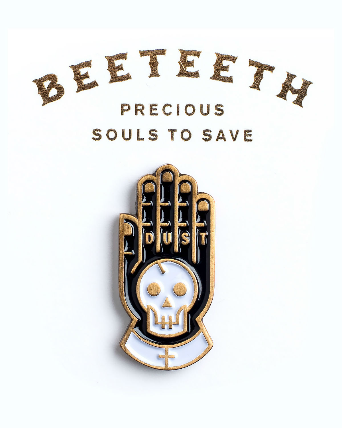
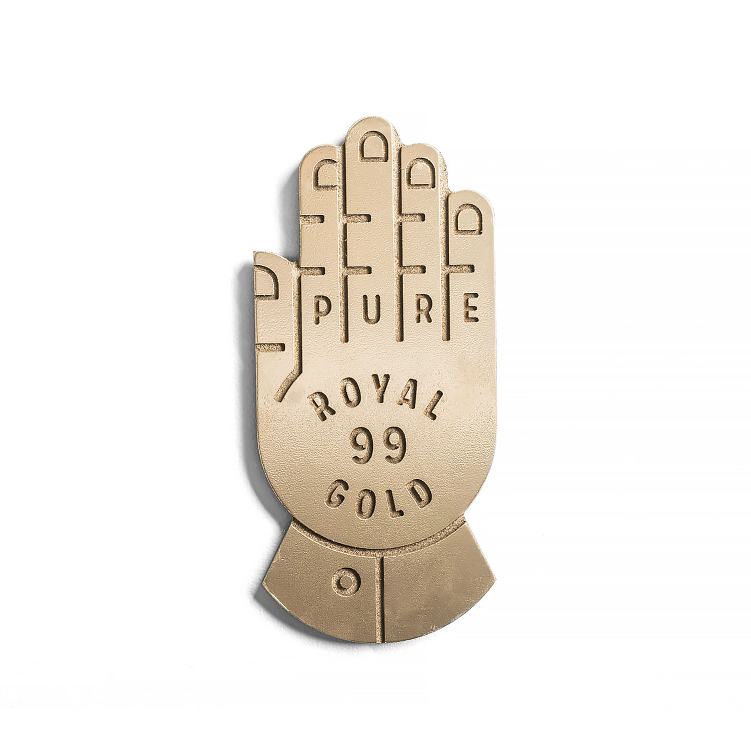
My drawings were always concentrated on the figures. I’d only draw the Ninja Turtles, never the sewer in the background. I felt like all the substance was in the subject, and I loved really expressive hands and faces. That felt like all of the story for me. The background scene felt so laborious that I didn’t spend a lot of time on the environments, the couches, walls and general elements of a scene. So maybe out of pure selfishness, to allow myself to love every bit of the process, I’d work on distilling my pieces so they could live as singular, iconic emblems, even if they were figures. They’d be symmetrical, with hands, limbs, and tools, in balance, all around them. Once I had that piece, I could use it and reuse it in so many applications, as an embroidered patch, or a stamp, or an icon set in foil on a book cover. Basically, just another way to get an evocative, meaningful piece of art to work commercially as well.
You’ve spoken of finding influence in the deep, religious heritage of Salt Lake City, and much of your work seems to reference religious symbolism and iconography. Do the symbols you make have specific ties to religion, or is it more about an artistic style to tell your own story?
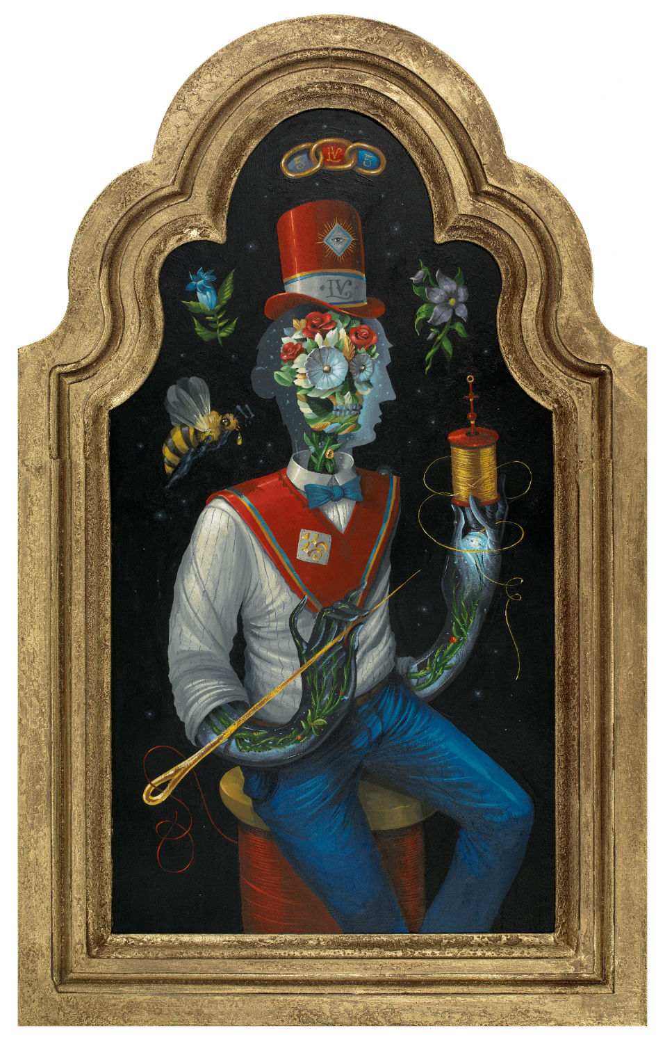
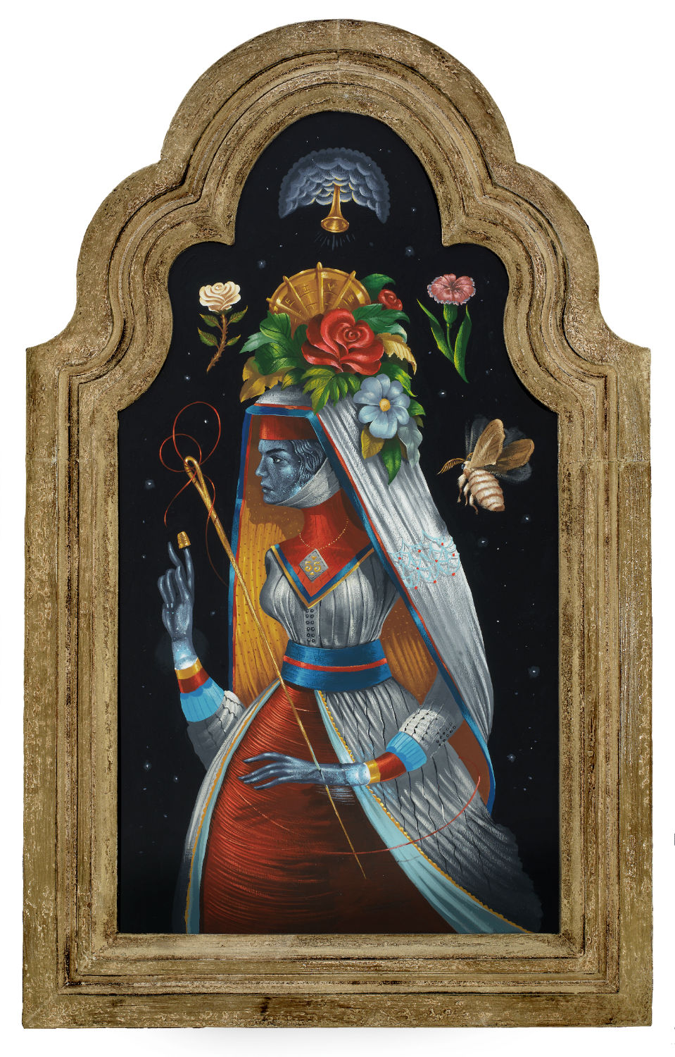
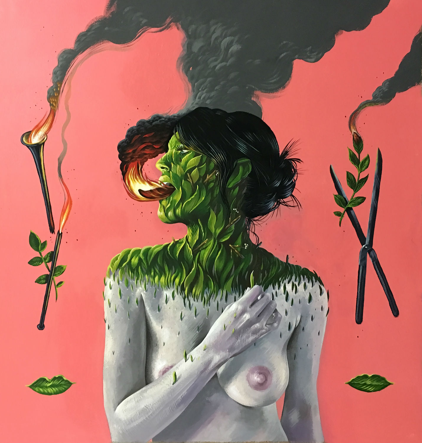
My interest in the use and creation of symbols definitely started off as a way to tell religious stories. They’re a great way to explore something abstract or unknown while giving the viewer space for their own interpretation. Catholicism has been doing this forever in such a beautiful way. And modern, frontier Mormonism felt like it needed more of these symbols, at least, so my generation could join the conversation. Plus, there were just so many cool stories from the history of the high western desert where I grew up. These narratives of seagulls, flaming swords, hidden gold, and visions from heaven were just begging for a modern, visual retelling.
But as my own beliefs evolved, I started to use my interest in symbols to help explain non-religious spirituality. I took a step back from my beliefs and started to see similar spiritual vibes and insecurities coursing through everything, even in non-believers. I wanted even these vibes to have some visual vocabulary to make them feel tangible or grounded, esoteric things like luck, coincidence, fate, passion, love, or premonition. You know, that mysterious connection with the unknown—electric currents of the universe that we all feel in some way. I felt like we needed something practical to help organize or even just accompany these experiences. That’s where the tokens, relics, pins, patches, pennants, and flags came into play.
Can you take us through the process of creating one of these icons? Do you find starting in a sketchbook to be helpful, or do you pick away at these things digitally?
I always start with sketches. By sketching, I’m able to quickly build a composition that can hold all the elements. Those first few sketches are really important and happen very loosely. I tend to almost blur my eyes, so I can see the rough whole of the icon, rather than the smaller details that make it up. If I can get that overall shape to work from a distance, the pieces inside tend to come together without much fuss. It often feels like the composition is already there on the paper, and if I let my eyes relax a little bit, and my hand start to move on its own, I’ll scribble enough lines to coax out the framework, and I can scan, redraw, and refine later.
I’ll also force myself to draw pretty small. It’s so much easier to experiment with a lot of options when I can keep them small and cheap. Too often artists will build up an idea as too precious which adds unnecessary pressure. Once I nail the right composition, I’ll trace over, scan, print it back out, and redraw to make a few more decisions. Then I’ll scan it in and add it as a background layer to rebuild digitally. Finally, I use all these really powerful fancy, design tools to make that thing mathematically perfect.
Tell me about the repeated use of hands, animal heads and knives in your work. Are these essential parts of your toolbox?
I’ve tried to be really prolific with my work. It’s helped me fight off that antsy feeling I get when I’m not creating something. I started developing repetition with pieces I could draw really well, just to produce more work. It gave the added benefit of offering a broader vocabulary to tell more stories or answer more questions. These repeating ideas all started with something important to me, though.
When I used to paint more figures, I instinctively focused on the face and hands. I felt like I could tell enough of the story if the hands and face were right. Hands became a really important thing for me. Sort of a subhead to the headline written on the face. The hands could tell the entire story without instantly giving away the punchline like the face does. Animal heads have a similar power.
I grew up in a family that loved animals. My dad raised pythons in our basement and trained falcons in our backyard. Animals seemed to be aware, but untouchable. Like, they knew something (maybe everything?) but you’d never get it out of them. I love that. Animal heads used to signify gods and goddesses, or power and glory in ancient art. With that narrative history, you can infuse so much meaning without really needing to deflate the bubble and explain it.
My ancestors come from an exiled religious group that settled in the Salt Lake Valley. These early Mormons used a mix of old biblical symbols, icons from freemasonry, and a sprinkling of their own arcane iconography to exchange sacred ideas within their community. It allowed them to talk openly about their beliefs, even proselytize to strangers, while keeping them personal, private, and bestowing the reverence they felt they deserved.

Many of these icons are framed in text. Are you going in with an image first and adding words after, or does it all take shape together? Do you have phrases written down for which you hope to create an image?
Yeah, the text comes from that leap across the hall I made in art school. Text just ensures that enough of the intended narrative can be passed to the viewer. It also adds really interesting and recognizable visual elements to a piece. Typography within an illustration also helps keep my pieces rooted in a more folk art context. Building phrases into these illustrations gives them a utility and a connection with the decorative art made by tradespeople to support some industry in their communities.
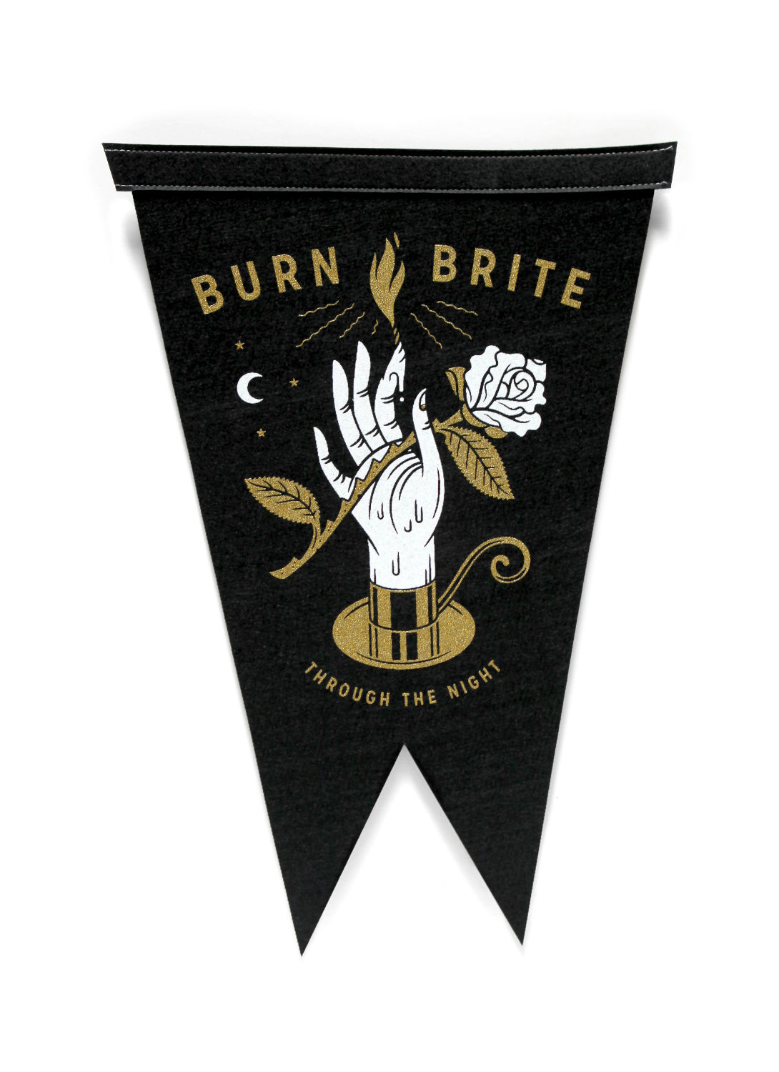
That also lets me be more literal about what the piece is trying to say. It can be a very clear warning sign with a graphic to reinforce the text. So, rather than having clever phrases written down, I have a simple idea of something bold that these pieces can remind the viewer: stay wild, keep quiet, think twice. I use my sketch process to find pockets for these phrases that help the image and text to live as a familiar whole, like a wordmark and an icon.
Is there a type of art that you look at for inspiration, and how has that directly impacted your style through the years?
In addition to all these old fraternal relics, I rely very heavily on textile and embroidery artists, woodcarvers from the Philippines, and sculptors and toymakers from Japan. I’m inspired by artists whose work affords a decent living, but sits outside the world of high art and definitely has some blue-collar utility. I think my work has an obvious connection with traditional tattoo sensibilities. There’s a long enough history in tattooing that artists have tested what can be done and have seen a really timeless style emerge: solid, black lines that outline bold fields of color.
There’s also a real conscious effort to keep line widths consistent, and relationships and spaces between lines are considered. I think that has a resonance with design-heavy illustration like mine. The symbology and visual vocabulary in tattooing also has a lot of overlap with how the fraternities and religions try to tell part of a very complicated story (the most provocative parts), but not enough that you ever stop studying it. Or just enough that you keep coming back to the piece for inspiration.
Do you find any ideas in music or movies? What type of media are you taking in when you sit down to work?
I find a lot of ideas in movies. I love movies. I tend to gravitate toward stories that sound way too weird to be true, but are, somehow, the type you tell to a small group, then realize halfway through that the whole room is anxiously listening. Folklore, tall tales, ghost stories—that’s what really gets me. I find a lot of that in documentaries or podcasts, or those true crime miniseries events that have you posting online in support of some person you’ve never met. Music also gets me, less for inspiration but more for a way to help relax my body while I work.
I tend to get really bad posture while I’m working, especially when I’m painting. Listening to an intense podcast or a book on tape makes it even worse. Music helps me move my bones a little bit and reminds me to adjust my spine and stretch while I’m working.
Would you say you owe a lot to your art education, or is a lot of what you do self-taught? What do you think can’t be taught, and what parts are best passed on from someone with more experience?
I would say I took from my art education everything I needed, but I had to do the taking. I was motivated and hungry enough that I learned a lot, but often felt like I was fighting against the politics of a university to get what I needed.
Drive, hunger, and motivation can’t really be taught—that’s probably something I learned from my parents, or had in me from birth. It also might be the most important part of building a career or practice as an artist. The thing I did learn in school was the ability to speak about my work and defend it. The ability to take criticism and give it is invaluable after you leave school. I think craft, skill, technique, ethics—those can all be self-taught. But the ability to stand up in a group and defend what you’ve discovered as unique about your work is incredibly important. Likewise, to be able to critique someone else, someone who is very proud of what they’ve done, that’s vital. You may have some small insight, that, If delivered with respect and confidence, could change their life forever. In my case, it could be the difference between me suffering in the painting studios, trying to make fine art, and having the confidence to walk across the hall and find myself.
----
Originally published in the October 2016 issue of Juxtapoz Magazine.


