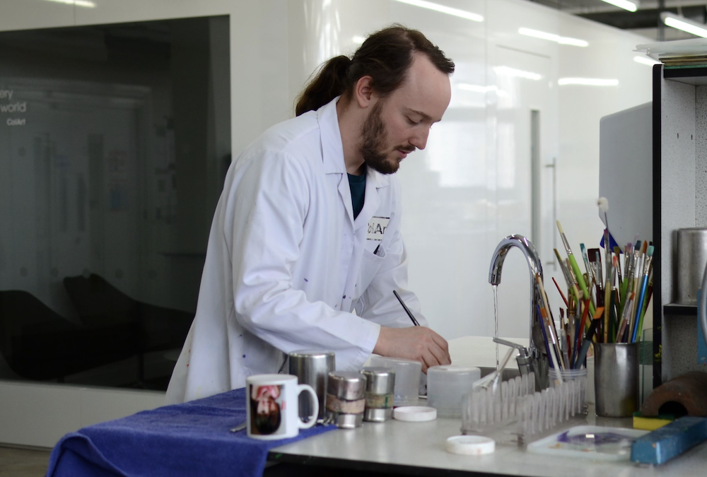
I ask a chemist who works for a 192-year old paint company, “What is a color?” and admit to feeling a little out of depth. As art writers, we perceive paint as the medium that preserves time—the representation of a time past. Rarely do I think about the chemicals that go into paint or the history of a company that has for years addressed and perfected the wishes of artists who want paint that achieves their creative endeavors. Founded in 1832 by William Winsor and Henry Newton in London, Winsor & Newton’s DNA is in the exemplary paintbrush of Turner and the color theories of George Field. This is a company that takes color and material very seriously, is meticulous about preservation, and has an understanding of the immense power of visual art through the centuries.
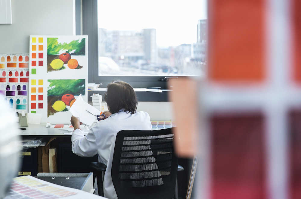
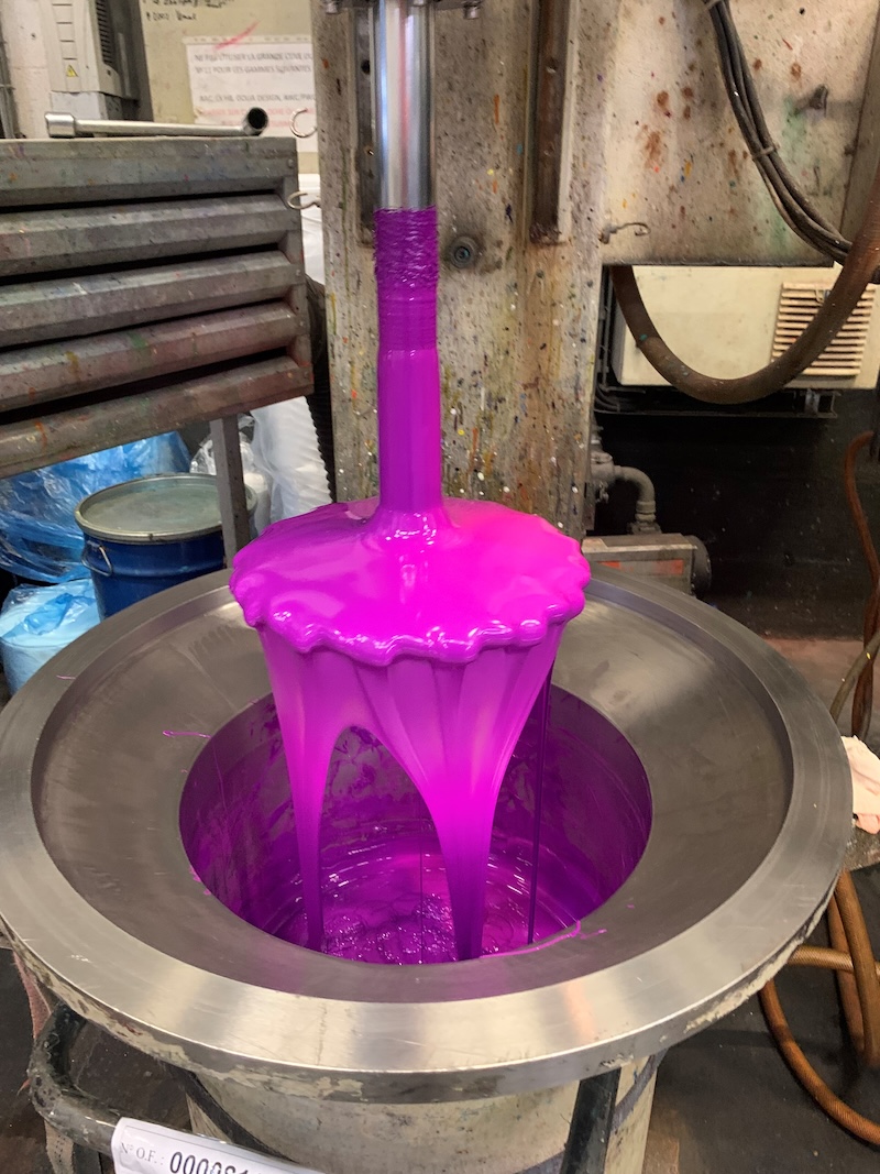
Recently, Winsor & Newton released their watercolor Revival Collection, eight historical colors charted deep in the company’s expansive and dedicated archives, recreated by a combined effort of chemists, brand and artists: Aureolin Hue, Field's Orange, Viridian Hue, Cinnabar Green, Tyrian Purple, Ultramarine Ash, Mineral Grey, and Ostwald Grey. We spoke to Resident Artist Stephanie Nebbia, Engineer and Chemist Pierre Sanchez of Research and Development, and Marta Tinoco De Faria, a Senior Brand Manager, to understand how to make a color, what goes into a revival, and really, what is a color anyway?
Evan Pricco: I wanted to start with what could be a simple explanation for why Winsor & Newton has such an enduring legacy.
Stephanie Nebbia: I could answer that as an artist because, obviously, I knew Winsor & Newton from my own training. Materiality is central to my practice, as it is for many artists. Winsor and Newton came together in 1832 as artists and scientists, boyhood friends who also happened to know J. M. W. Turner. They wanted to make materials that were accessible to artists. And what that means is not just easily available colors, which geographically were more difficult to procure at that time. It was also about other things that were prohibitive, cost, toxicity, and lightfastness, so they really understood the wider issues of making materials more accessible. They worked with the color maker George Field and Winsor and Newton took this relationship and their desire to formulate the best quality colors. I believe that they are the only brand that has had lightfast tested colors since they began, all the way through their history. Their very DNA has been about more sustainable, accessible color making so that artists have a wider palette that is actually durable and lightfast, and this has been really consistent. So I think, as an artist, it's that core DNA of the quality and integrity of making color.
How do you actually replicate a color? What is the science behind this?
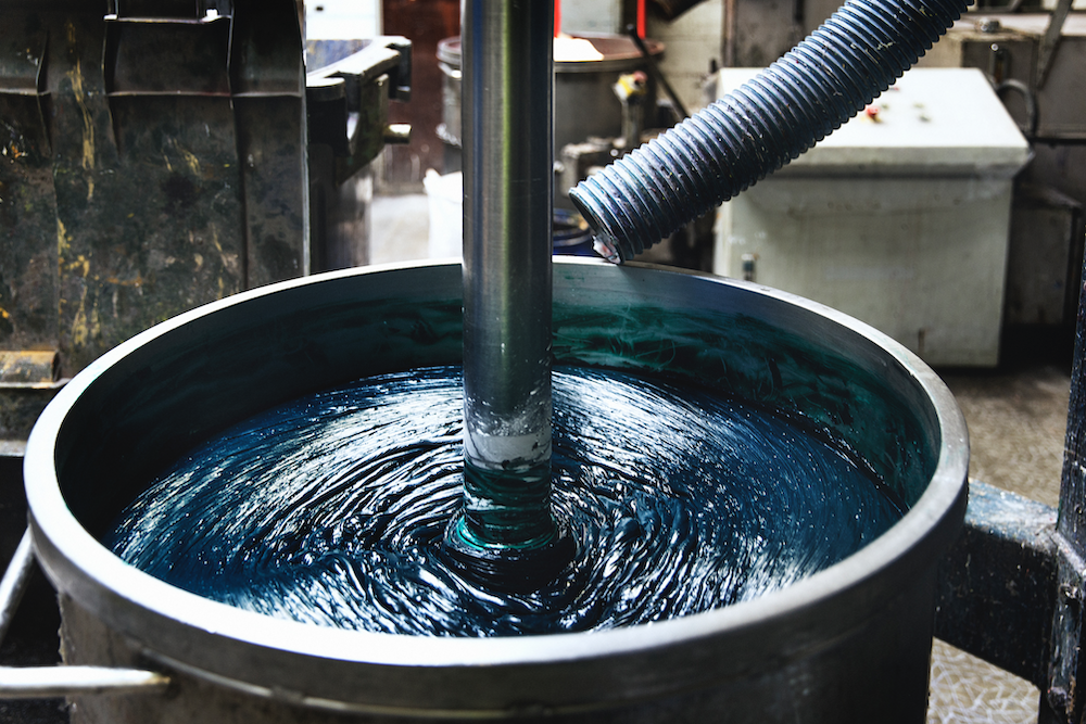
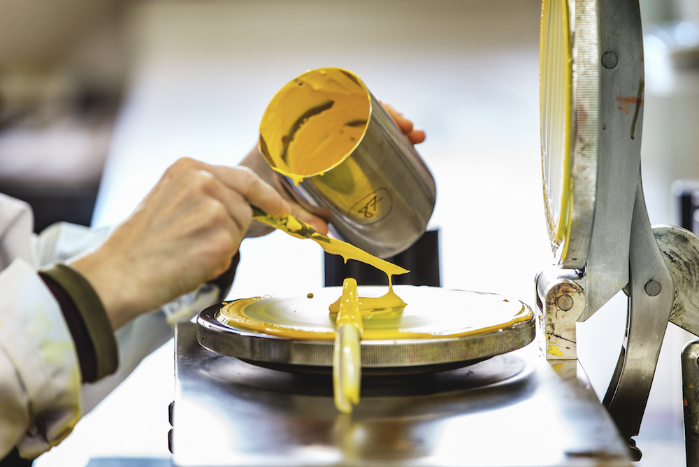
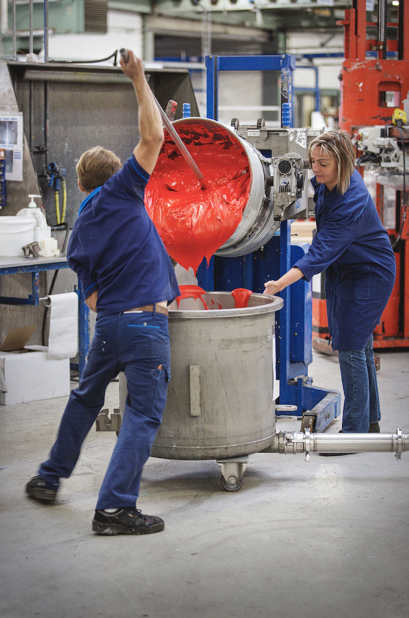
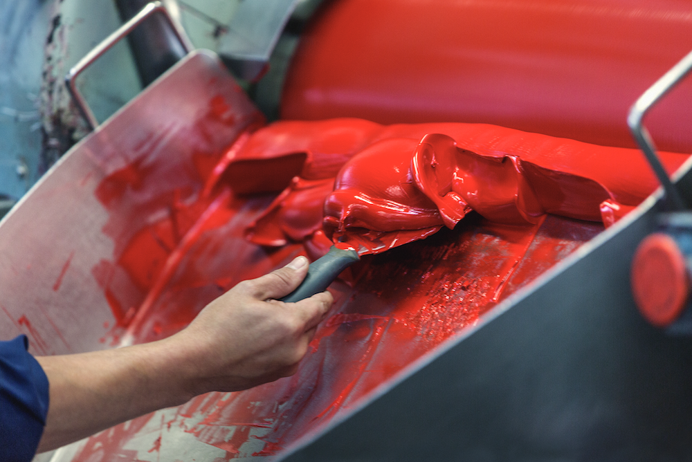
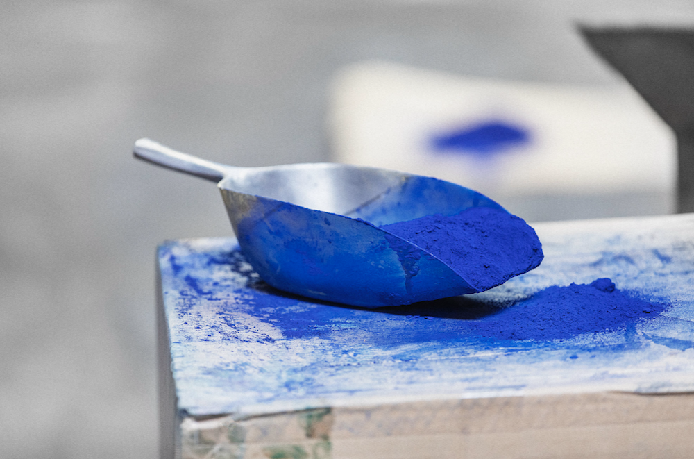
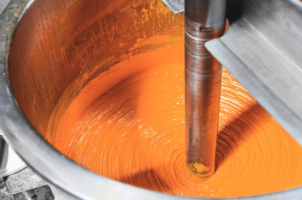
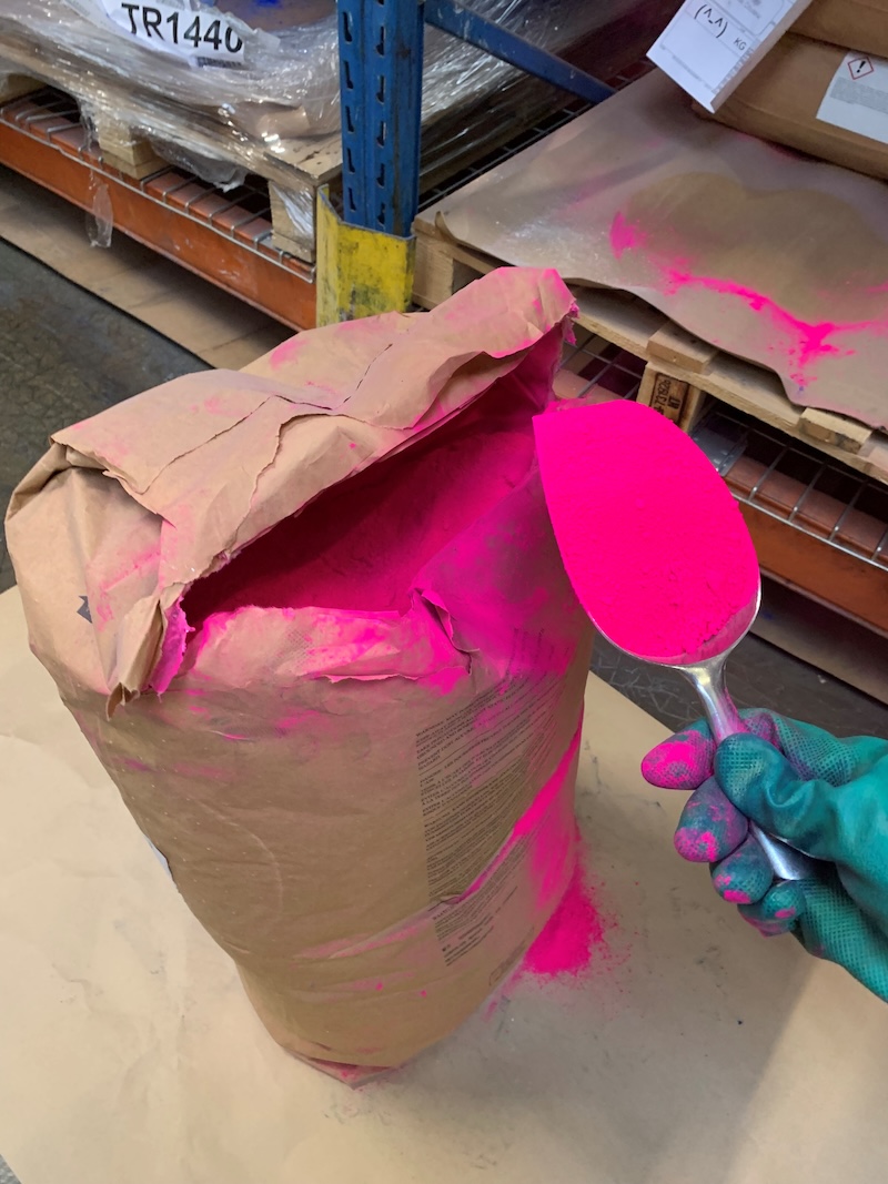
Pierre Sanchez: The core principles haven't really changed. We are making a paint by mixing coloring materials, namely good pigments and the binder. However, what has really changed is sorting and sifting out, removing what's not good, removing what's toxic, and bringing new raw materials with higher quality, higher reliability, higher solidity, and durability over time. More and more today, it's still true, trying to get the best pigment with the best lightfastness and, of course, the best color. We also look at the safety of the users and the workers in the factories, which is always being improved. So, the core principle of physics hasn't changed. We're still making the paint on the same principle. What we use to make it has evolved tremendously.
So how do you tell the story of reviving legacy colors?
Marta Tinoco De Faria: To create these colors, we worked together—artist and scientist—and as a brand, I’m in the middle linking it together from conception to launch. We looked at our archive, more concretely the George Field book, and we identified some groups of colors that were heavily used in the history of the arts and eventually disappeared for some reason, either because they were toxic or we were out of the pigment, and said, “Okay, this disappeared. Let’s see what we can do to revive them.” We crossed this information with the most demanded color of today’s artists from research and the gaps in our current color chart and ended up with this beautiful selection of vibrant colors and subtle granular grays.
Let's talk about the creation of one single color. How does that even happen?
PS: I think you will have the most interesting story in Ultramarine Ash, so I would pick that one. I think that's the one color where we will have the most to say.
SN: I pestered for that one for many years. I know there's lots of research and data that goes into responding to the audience's needs, but certainly, whenever I've shown anyone the archive, whether artist, designer, academic, or retailer, they were always struck by Ultramarine Ash’s beauty in the archive. Winsor & Newton really perfected the levigation and cleaning of ultramarine. Lapis is a very difficult color to make a pigment from, and they embraced it in the same way with the arrival of synthetic alternatives to ultramarine, which meant that it suddenly became a color that was accessible, which really responds to the original DNA and mission of Winsor & Newton. In order for Ultramarine Ash to really possess that beauty as a tint, it needs to be transparent.
So it's not a question of just making something a paler version of something. You need to retain its transparency, so Pierre spent a couple of years really perfecting this exquisite color that adds a tinting potential to so many other colors. It's really in the way in which Payne's gray was created as a subtle tonal shift. That was a curation of pigments, so it wasn't such a jump to tone or color as you would get using black; we have the same potential now with the ultramarine ash to tint color with that subtle shift rather than use white. Do you see what I mean? It really has a unique characteristic when mixed with other colors, so it’s not just about the beauty of the color on its own, which you can see just over my shoulder here, but also about what it does when it’s used.
PS: For the history of the project, as Marta mentioned, in the early stages we discussed a list of historical colors and why they were discontinued. Then it was my turn to see what I could do and see what I could find in the raw materials and the pigments we already have in our extensive library, as well as the new ones I could find with new suppliers, looking around to see what I could do. From there, I made a list of what I thought was possible, and there were, maybe, about 20 suggestions. Then, gradually, it was narrowed down by Winsor & Newton. Ultramarine Ash kept being selected at every stage, and this one is one, because of the history of the pigment itself, was not a new pigment we needed to source. It was a more challenging formulation on how to make a more subtle ultramarine blue without just making what I’d say was a diluted color. It would be easy for me to take a French ultramarine and put in less pigment, but that wouldn’t be ultramarine ash.
This is going to sound like the simplest question, but how do you even begin to determine that what you made is really Ultramarine Ash? How does everyone come to agree, "This is correct, this is the color?"
SN: Well, that's where we're really fortunate because we have this incredible archive that has the actual tint books that were painted at the time and not exposed to light. They are exactly as they were when they were painted. I sent the tint books to Pierre because the matching of color is so specific to the core of the brand. It’s extraordinary to be able to use the past in that way to inform the present, and I think this is where the revival of these colors is so significant because we're actually matching them with the actual color from the past and the archive.
I think there were a number of examples in 1937 that were a really good range to show the very gray ones and the very blue ones. And certainly, for me, they were the most interesting. You could see the differences between different grades and shades. And so that was a really good point in history, because also at the time, in the 1930s, you had Scott Taylor, who was the director of the lab. So this is what I mean by DNA is that, in 1832, you had Winsor & Newton, but in 1930, you had Scott Taylor, who was an incredible chemist and director of chemistry. He was the one who translated and published Oswald's Color and Science, which was then taught at the Bauhaus. That continuity throughout history—not just that we did something really well then, but... it's consistent. And so having the actual pigment, the actual pigment from 1832 is in the archive, so the actual pigment. But we also use tint books from the 1930s to show the consistency and understanding of that color throughout the history of the brand making color.
Pierre, with your expertise, do you have a color eye that allows you to see a painting from the last few hundred years and understand its components and integral qualities?
PS: Usually, it's not that big of a mystery, even if there seems to be a definitive answer. But for blue pigment, depending on when it was painted, the selection was pretty mild, and the same for white pigment. If it was in 1915, you didn't have titanium white yet, so it was most likely lead or zinc. If it has turned poorly on a painting, probably it was lead. It’s a science when it comes to the history of pigments that were used in previous centuries. It's not directly in my field of expertise, but I'm always curious.
What did you all learn about color in the revival color process? Do you have a little anecdote about one particular color, or is there something that you learned in the process?
MTF: When Steph told me the story behind the Tyrian purple, I was really kind of shocked. When you get to know how people got the elements and pigments to paint in old times, it is just incredible. Tyrian purple was, at the time, a dye from a Murex sea snail found in its bronchial tube! Twelve thousand snails were needed to produce a gram and a half of dye, which was not really sustainable and very expensive as well! So when you are relaunching, but avoiding all these processes, moving to a more sustainable synthetic and getting the same intensity of the purple, we are sustaining art and artists in the future.
Winsor & Newton's Revival Collection is at winsornewton.com // This interview was originally published in our FALL 2024 Quarterly Edition