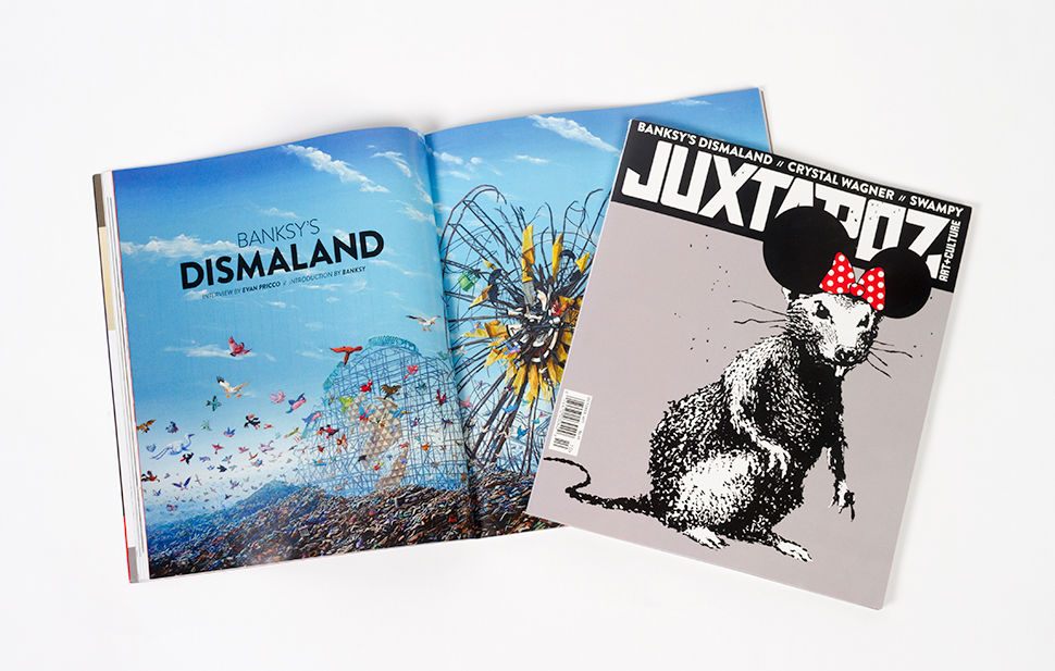
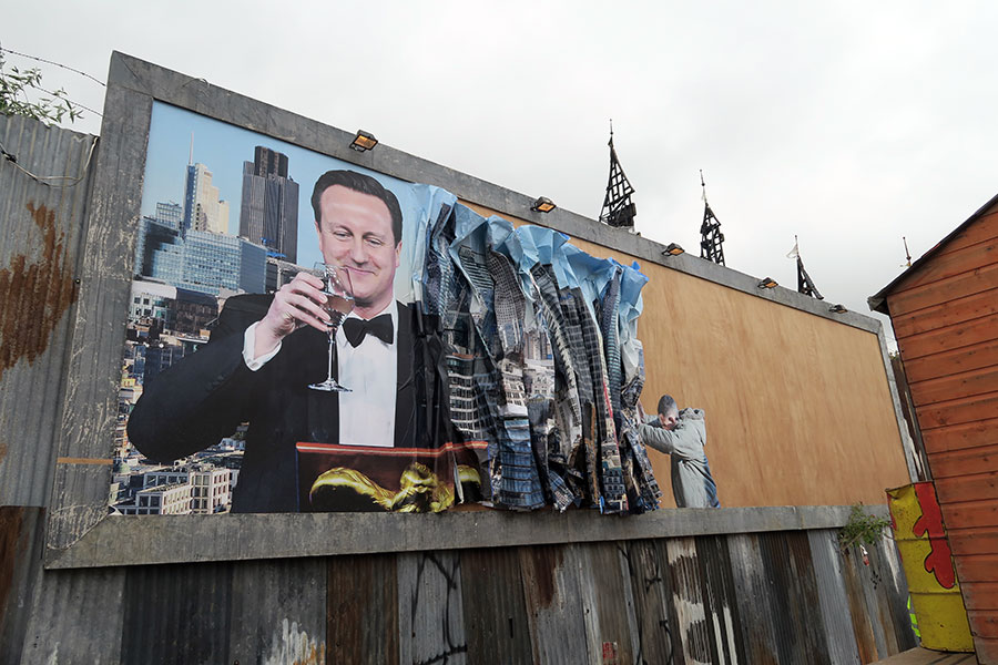
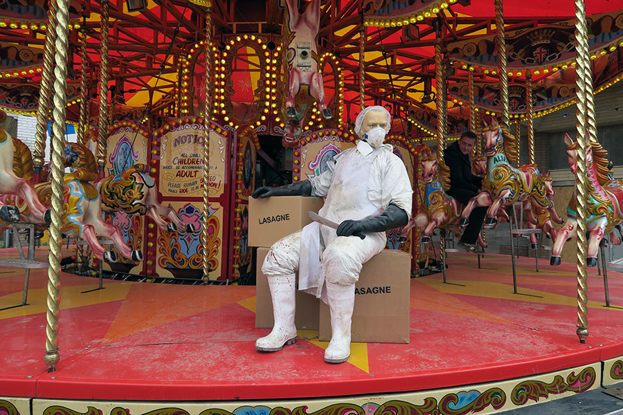
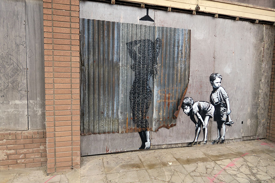
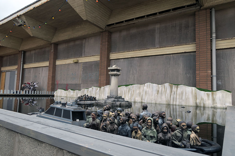
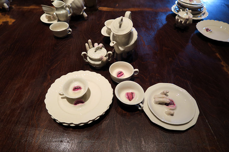
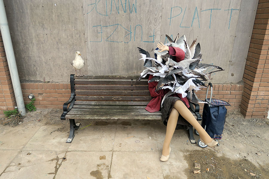
For the October, 2015 issue of Juxtapoz Magazine, Banksy contributed not only the cover story and interview, but a statement about Dismaland and his first foray into theme park management. We get firsthand insight into how the project came about, how the artists were chosen, and why the destination is so pertinent...
Introduction by Banksy
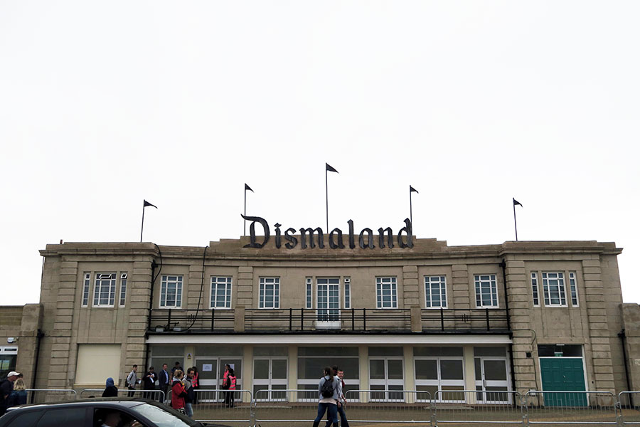
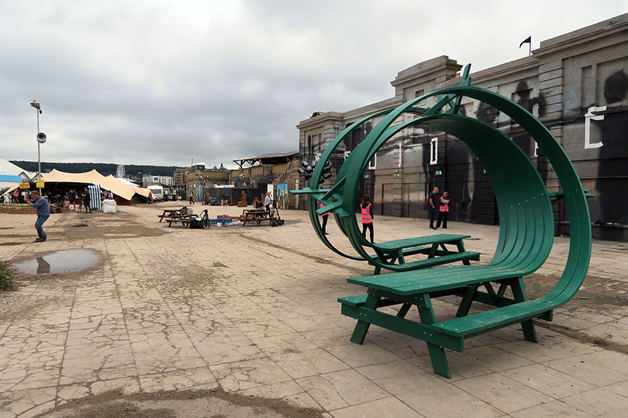
Dismaland is the latest innovation in family light entertainment by the graffiti artist Banksy. Installed in the centre of an unfashionable British seaside town frequented by low-income families, Banksy describes it as “the perfect art audience.” The location is a former lido comprising four acres of walled seafront compound, which in recent years has come to more closely resemble a neglected prison yard, an atmosphere Banksy has endeavoured to preserve by declaring that none of the installation crew were allowed to bring a broom.
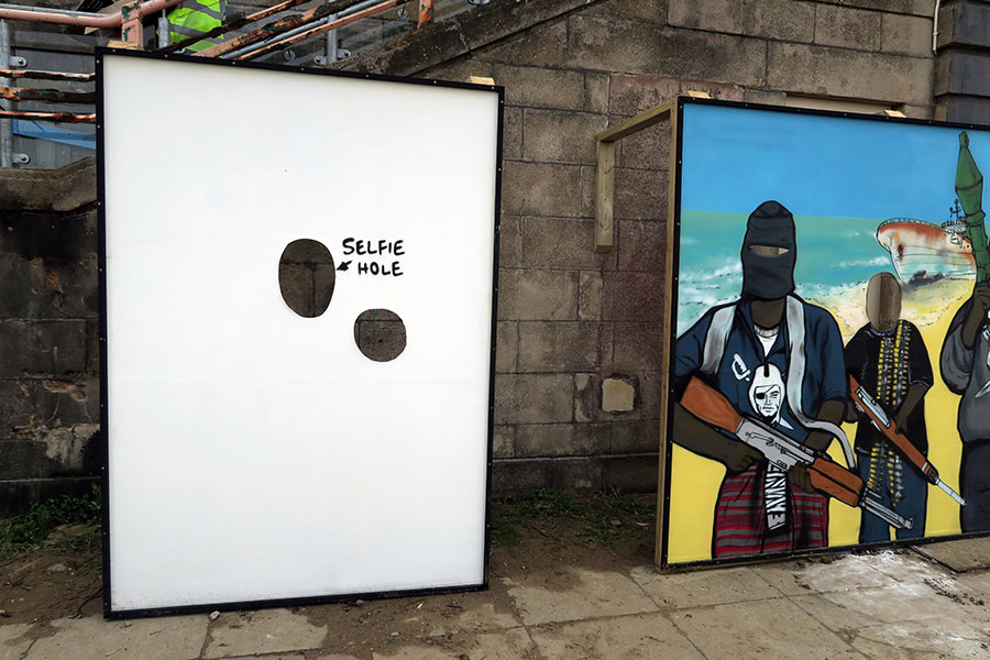
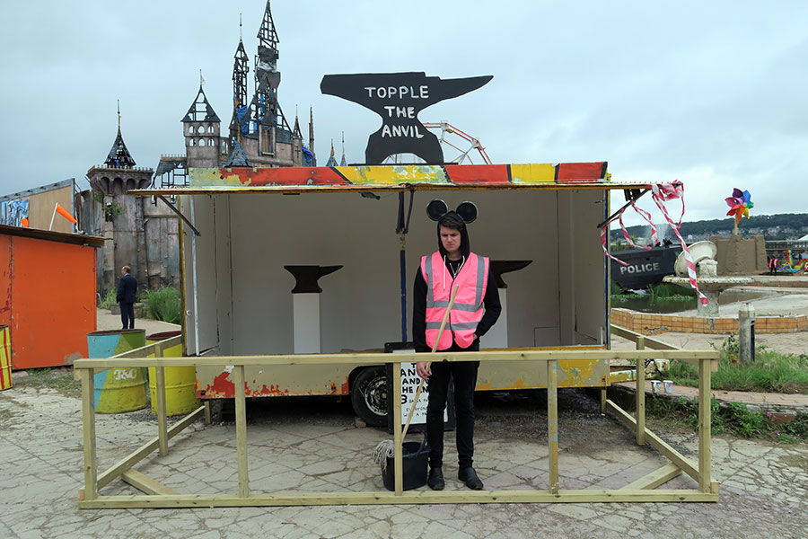
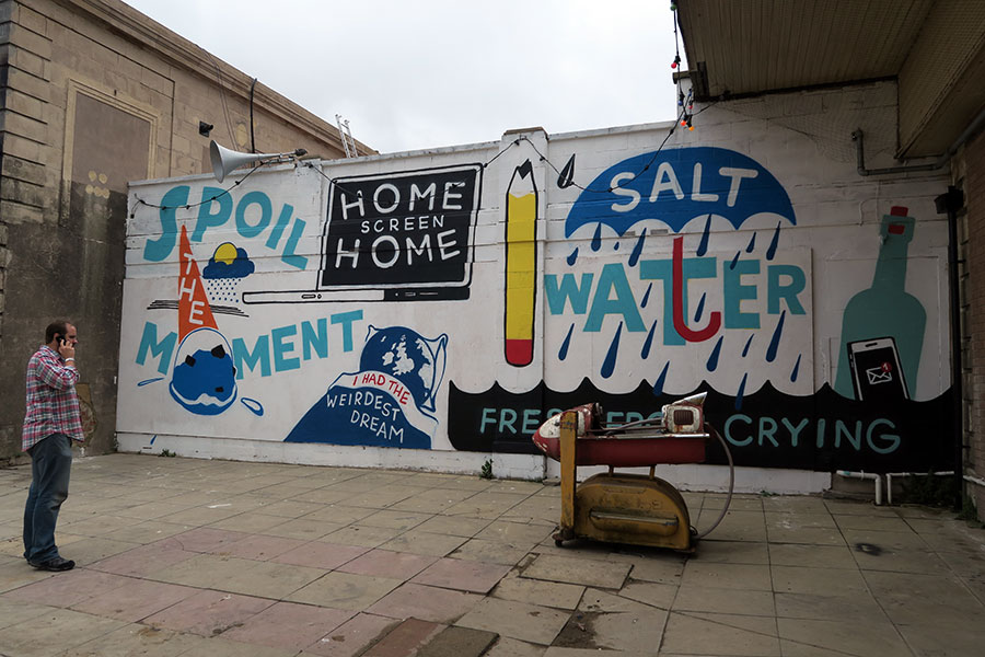
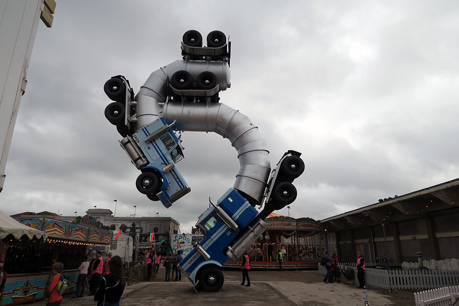
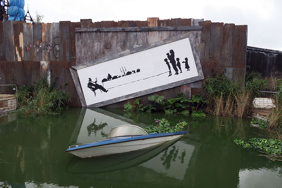
This is an art show for the 99% who would rather not be at an art show. It features a fairytale castle, a boat pond, arcade games and extensive water gardens, all given a distinctly modern twist. But beyond the Mickey-taking is a deadly serious attempt to assemble a show that takes stock of its generation. “It's scrappy, incoherent and self-obsessed, so maybe we're halfway there,” says Banksy.
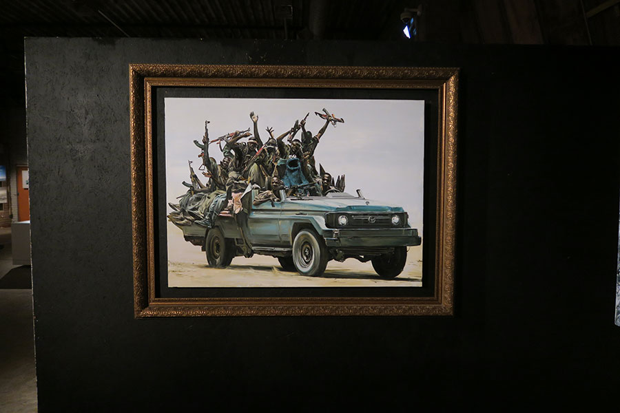
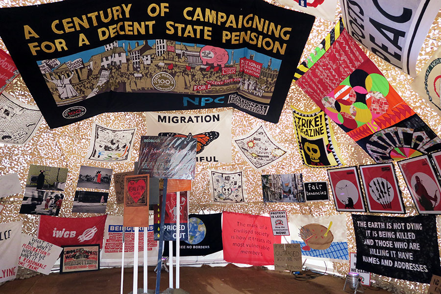
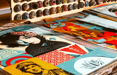
This is certainly not a “street art” show—an art form Banksy describes as “just as reassuringly white, middle class and lacking in women as any other art movement.” The roster of artists ranges from Jenny Holzer, winner of the gold medal at the Venice Biennale, to Ed Hall, a pensioner who has spent forty years producing every major trade union banner from his garden shed.
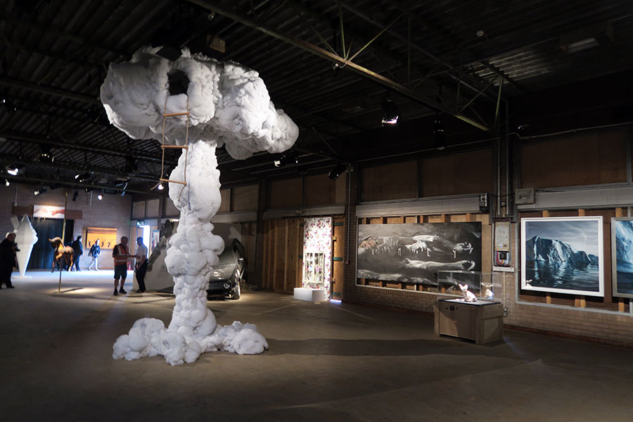
Visitors are taken on an unflinching journey of art “made in the shadow of gathering clouds,” literally in the main gallery, as Dietrich Wegner's Playhouse towers above the centre of the room. Truly global in scope and scale, you will find art from Israel and Palestine hanging side by side.

Banksy Sketch of Dismaland, Copyright Pest Control Office Ltd.
Does it represent any distinct art movement? Banksy has come up with the term “post modem-ism” and is valiantly trying to make it fit. This is art with high “click potential,” something achieved by containing more than one strand of thought or technique. “It’s flower embroidery, but done with a power drill into car bonnets,” or, “It’s a greenhouse, but all the seedlings are sprouting from ready meals.” This is art that thrives and is shared in the online environment—art that has an “and” or a “but.” The digital world demands more than the humble portrait or landscape, and these artists serve it wholeheartedly.
As ever, Banksy has constructed a show that essentially speaks to his fifteen-year-old self. It shouts “another world is possible” at every turn. And this event actually provides some tools to achieve it. Visit “Guerilla Island,” an activist’s area where you're able to buy the specialist keys that unlock bus shelter advertising hoardings alongside workshops in how to replace their posters with your own.
One end of the site is dominated by a windmill, Banksy's attempt to power the entire site using a giant copy of a child's pinwheel, only to find the results seriously under-powering. “I guess it’s become a monument to how much further we've still got to go,” he says. —Banksy

Banksy Sketch of Dismaland, Copyright Pest Control Office Ltd.
Evan Pricco: What, in particular, was the genesis of this project? Were you surfing the web and grabbed by some insights on how you wanted to present Dismaland and the artists you wanted to work with? Was it a way for you to gather together a bunch of people you admired to create one thing? Is it a little bit like the chicken or the egg? Was curating a group show something you wanted to do with these artists, or did seeing all this art make you think up Dismaland?
Banksy: Like so many projects, it started with a gap in the fence. Eight months ago, I came to Weston on a windy day, and one of the boards on the gate had blown down. From the first glimpse through the gap, I was smitten. I used to come here swimming as a kid, but no one’s been inside for fifteen years.
The best thing is the wall. It means you get to have a show outside, but within a heavily fortified beach-front compound. That’s quite unusual.
I first thought it would be a solo show. But then, after the city council agreed to lend me the building, I immediately sobered up and went looking for help. A lot of the art is as much a surprise to me as it will be to other people. I only came across Neta Harare Navon three weeks ago when I was online shopping for sheds. And what do you know, she’s quietly over there in Tel Aviv making the perfect model of how to paint. You mail her and she comes over—incredible.
It’s a good project because it keeps surprising me. And this is what I’ve learnt over the years: no amount of PR or hype can sell the world something if it’s not exciting you.
Did you ask each artist to make new work? Or was there an opportunity to show past works you liked?
A bit of both.

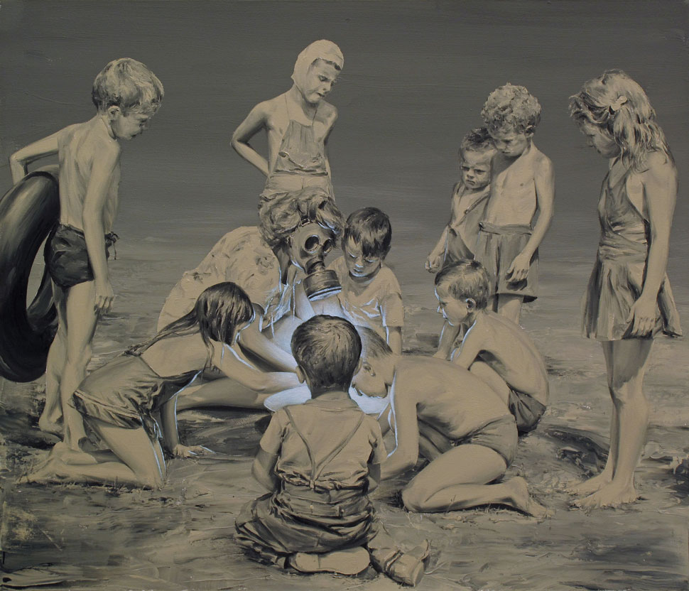
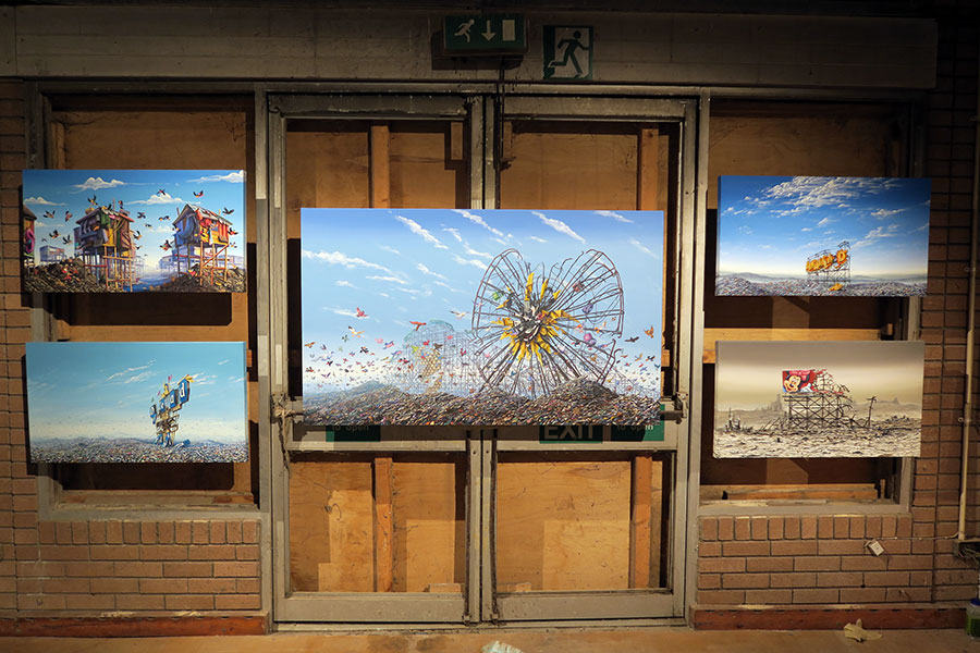
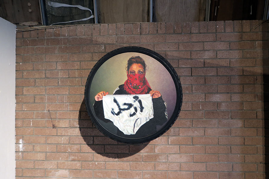
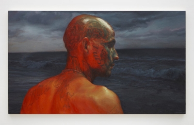
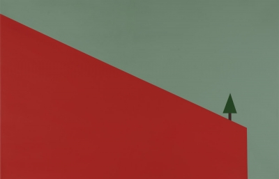
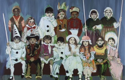
Paco Pomet Internacional (Left) and Shadi Al Zaqzouq Rock Me All Night Long (Right)
So was there anyone you chose to be in the show that brought out ideas which changed the course of Dismaland?
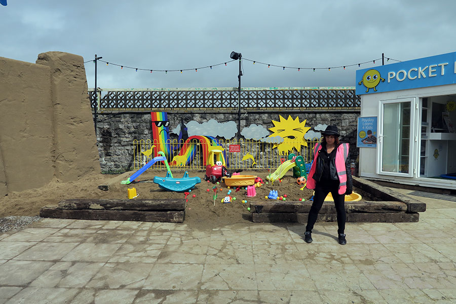
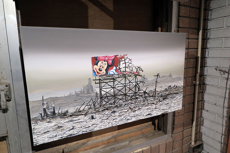
It’s been enriched by a lot of people and grown. It’s pretty unusual to find a children’s playground with a payday loan shop attached. But it’s always been quite a broad brief, to embrace or attack any part of the light entertainment industry you’ve ever been sold or let down by. Essentially, the big theme is that theme parks should have bigger themes. Although I did institute a site-wide ban on images of Mickey Mouse.
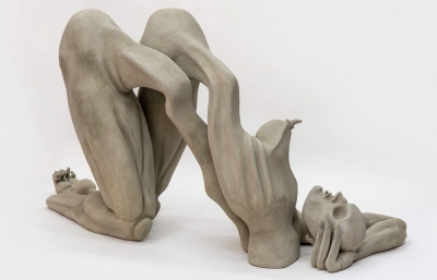
Some works that I’ve seen so far have obvious political impact, but there are a lot of artists who are subversive and just plain funny. Was that a balance that you appreciated and wanted to see living side-by-side? Obviously having Zaria Forman's beautiful natural landscape paintings next to Jessica Harrison's porcelain pieces has two narratives, although together they can create an interesting storyline and visual experience.
Yes, I should make it very clear: this is not a street art show. There are women in it.
Tell us about your role here. Has it been an interesting process being a curator? Is it a role that you enjoyed?
It turns out curating can be surprisingly creative. For instance, I asked Jenny Holzer for one of her electronic signs, but she didn’t have anything in stock. She said she was happy to supply the text, but I’d have to find some signs. I asked a lighting guy to get a big LED screen and he came back with a system that cost £8000 a week to rent. I couldn’t afford that, so I suggested we record Jenny’s slogans and play them over the Tannoy system. She liked the idea and said she’d never done anything like it in forty years. So now we have a totally original Jenny Holzer that cost fuck all.
Did you do a lot of editing? Were there things you liked at first that got cut out and other things that grew because you liked the direction they were heading?
A lot of the decisions have been made by neglect. I put together a whole list of artists and pieces I wanted, and then, a month later, if I hadn’t done anything about it, I knew it probably wasn’t worth pursuing. When you’re busy, the most important things have a way of asserting themselves. I discovered “not now” is as valid a reaction as anything else.
How much does the reaction matter to you? I know it matters to us, the critics and audience, but fuck us for a second. Does it matter to you?
I’m at a point with art where I only really care if the piece is more than the sum of its parts. I’m lucky because what I make either succeeds or fails. Some people undoubtedly would tell you that’s why it’s crap art, but that’s the way it is. I feel sorry for Abstract Expressionists—how do they know when to go home?
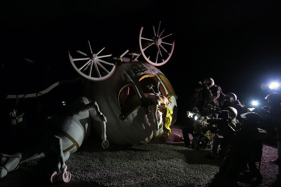
All I need is to make my point and get something more out of it than what I put in. If something extra has happened between the idea and realizing it, that’s a win. This week I surrounded my Cinderella’s carriage with a ring of paparazzi, and the flash bulbs made the shadows leap around the room, and the pumpkin looked like it was lit by flickering candles, so I’m good. I never saw that coming.
My satisfaction level is independent of your opinion. If I feel a piece has worked, there’s nothing you can say that will take that away. And the flip side is, if I know it’s failed, there’s nothing you can say that would make it OK.
This project, in particular, is so destination-based that you will really rely on audience reaction. You have always been good at controlling your message, but did joining social media teach you anything that you liked? Or disliked?
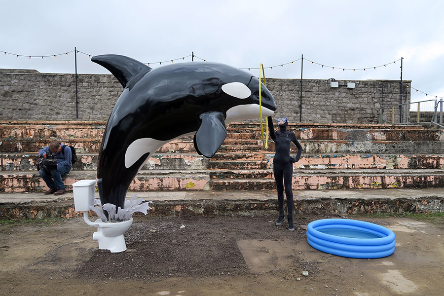
The last show I did was at the Bristol Museum and a lot of people came. In fact, the queue was the most interesting thing about it. I don’t know if people will show up this time, but I made a few pieces with the audience in mind: the Cinderella sculpture is only complete when surrounded by a gawping crowd snapping photos. The audience is the punchline. Likewise, the killer whale is crap in real life. It’s only good when you pose behind it pulling a face and send a picture to your mate.
What are you hoping visitors take away from Dismaland?
A souvenir programme, three T-shirts and a mug. Each. This project isn’t sponsored or government aided; it’s self-financing.
For more information, visit dismaland.co.uk

